Overview
CLIENT
SambaSafety is the industry leader for SaaS driver monitoring and risk management solutions – supplying analytical insights that help companies make hiring decisions, provide targeted training, and address risky driving behavior.
PRODUCT
Replacing Vigillo, Qorta SaaS is the most comprehensive driver monitoring platform on the market – providing companies with continuous and reliable, cloud-based driver monitoring and driver-safety data to ensure safe drivers are on the road and behind the wheels of company vehicles.
BACKGROUND
SambaSafety users were reliant on an archaic reporting platform, Vigillo, which used annual Motor Vehicle Records (MVR) to evaluate the safe and risky driving behaviors of company drivers. Using this outdated method left companies uninformed of MVR updates occurring between annual reports, and put users at risk of high liabilities.
PRODUCT STRATEGY
Provide an improved user experience with simplified workflows to help users better monitor real-time driver behavior – while simultaneously migrating users from the outdated Vigillo platform to the modern Qorta SaaS platform throughout the redesign.
OPPORTUNITY
With rapid growth and the acquisition of clients like UPS and FedEx, SambaSafety wanted to redesign their old reporting platform, Vigillo, to help users lower their costs, reduce administrative burdens, and improve roadway safety by supplying frequent driver updates.
ROLE
Lead Product Designer

Upon validating our assumptions and ideas with users, the following key findings were identified:
Findings
CONTINUOUS DRIVER MONITORING
To take appropriate action, users needed to be clearly informed of errors committed by company drivers, and needed guided instructions on the correct steps-of-action to take.
REPORTING
To increase administrative productivity, users needed an easy-to-use platform with streamlined information that would allow them to organize company drivers into risk categories and provide an easy line-of-sight into necessary corrective actions.
AUTOMATED DRIVER MONITORING
To reduce the administrative burden of driver management, users needed automated state-to-state motor vehicle reports regarding incidents, crashes, and license status changes for company drivers.
SIMPLIFIED WORKFLOW
To provide user-centered experience, users required an intuitive and easy to use product with a visual direction that included high contrasting colors, large fonts, visual icons, and a simple to understand design.

Safeguarding 30% of America’s workforce via revolutionary driver risk-monitoring services and solutions.
QORTA
With the industry’s most comprehensive driver risk management solution, Qorta SaaS ensures that only the safest individuals are behind the wheel of company vehicles.

Features
ALERTS & NOTIFICATIONS
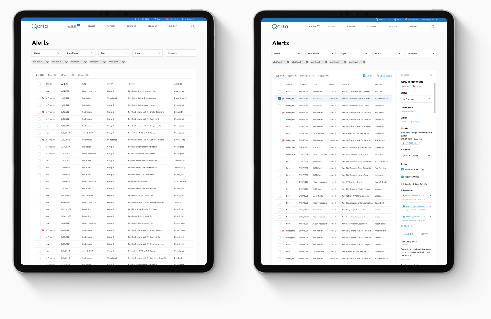
Q Alerts is a feature within Qorta that “alerts” users of driver activities – keeping 15,000 daily users up-to-date on the activities of company drivers and influencing actionable workflows to resolve issues and mitigate risks.


EMBEDDED REPORTS
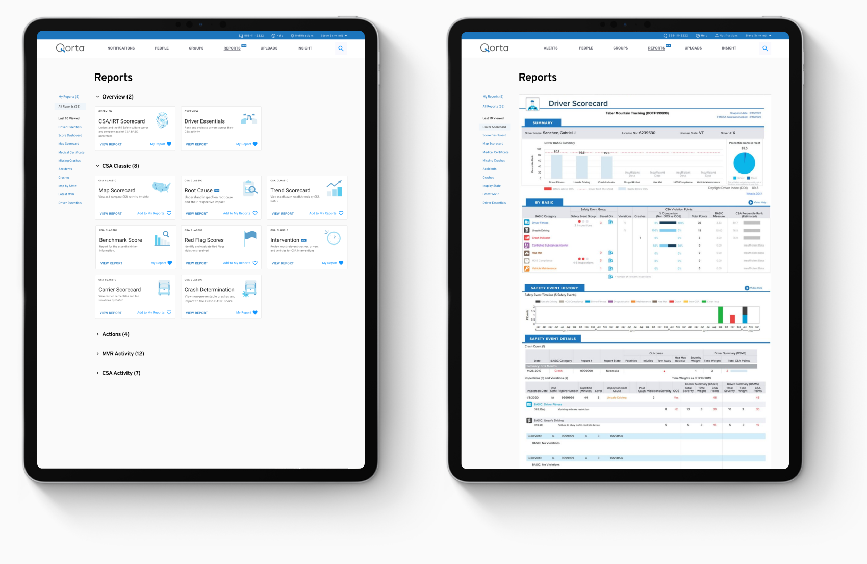
In order to increase brand consistency among products and improve the overall experience for Qorta transportation customers, the redesign introduced an ability to embed data reports from the previous application (Vigillo) into the new Qorta analytics platform.


GROUP SUMMARIES
Group Summaries allows users to compare and evaluate Compliance, Safety, Accountability (CSA) activity across driver groups in Qorta. This functionality is particularly important to larger customers (UPS, FedEx, DHL) who map driver groups based on complex organizational structures, and require a means of pinpointing CSA issues that are unique to respective business units.


DESIGN SYSTEM
To support consistency among designers and establish recognizable patterns for users, I created a component design library with preset and reusable graphic elements and usage rules for the entire application.
In addition to maintaining consistency, the design system helped speed up the development process by removing the need for new component development, and offering easy customization and flexibility options.
Example highlights a small part of Qorta’s design system


The team went through a collaborative process lasting 4-6 weeks, for each project.
Planning
WHAT GOALS ARE WE TRYING TO ACHIEVE?
During the Planning phase, my objective was to achieve an in-depth understanding of the client’s business. To do that, I met with Samba’s senior leaders to gain an understanding of the corporate strategy and company initiatives which enabled me to develop a business-model canvas and product roadmap.
Challenges
SATISFYING HIGH DEMANDS
While designing Qorta, one of the main challenges was balancing and satisfying the high demands of a fast-growing customer base, while responding to a rapidly evolving roadmap driven by the sales and marketing team.
SOLUTION & RESULTS
Overcoming this challenge, the team and I established three necessary criteria for success:
1. Business goals and requirements need to be defined, understood, and solidified from the very beginning of the project inception.
2. Involve the marketing and sales team from early stages of the design process.
3. In order to sustain success, development needs to continue on existing products, and there should be a rigorous user validation process before new products are developed.
TENSION BETWEEN SHORT AND LONG-TERM OBJECTIVES
In light of an urgency to complete the project and a short deadline, our team experienced increased pressure between short-term and long-term objectives – experiencing both difficulty prioritizing the high demands of customers amid business demands, as well as overlooking the project’s long-term vision for short-term tactical product features.
SOLUTION & RESULTS
Overcoming this challenge, I established two necessary criteria for success:
1. Creating an object oriented roadmap, forward-looking product strategy, and short-term tactical plan is necessary to deal with immediate concerns.
2. To serve well under the pressure of an urgent deadline, I needed to balance my time and obligations, as well as develop strong collaborative and conflict resolution skills.
OUTCOME ORIENTED PRODUCT ROADMAP
The product roadmap communicated my plan for realizing the product strategy, and enabled rest of the team to align on the product requirements and overarching business goals – helping to communicate the current and future state of the product.
Example shows the product roadmap for Qorta Group Summaries

LEAN CANVAS
The lean canvas provided a high level overview of the business model and helped me to stay disciplined about documenting and validating riskiest business hypotheses.
Example shows lean canvas for Qorta Group Summaries

Discovery
WHAT PROBLEMS ARE WE SOLVING? AND FOR WHO?
During the discovery phase, I utilized various UX research tools to capture a deep understanding of both the business case and the product’s users.
Challenges
IDENTIFYING MUST-HAVE FEATURES
The team had numerous appealing and inspiring proposed features and ideas that would significantly increase the value of the product. Most of the proposed features required constant negotiations with the engineering team to determine their ability to develop the product within the desired time frame. This made the process of moving ahead and identifying the product’s direction difficult.
SOLUTION & RESULTS
In order to stay focused on the user while overcoming the challenge of development feasibility, I conducted “Persona Review” and “Risks & Assumptions” exercises to pinpoint the needs for each user persona while reducing the risk of engineering uncertainty.
CONFUSING ADDING FEATURES WITH IMPROVING PRODUCT
Our team was constantly being challenged with the addition of new features during the stakeholder review meetings. The continuous requests for new features not only complicated the product but also increased the scope of work as well.
SOLUTION & RESULTS
As a product team, we identified all of the proposed features, stacked and ranked them utilizing an “Interview Synthesis” exercise, and focus on the underlying issues that were discovered during the interviews and “Goals & Anti-Goals” exercise – specifically targeting value add product benefits and usability issues within the current solution (Vigillo).
HEURISTIC EVALUATION
Conducting a heuristic evaluation allowed me to analyze the application’s entire user interface, in order to create a list of UX observations and recommendations.
UNDERSTANDING COMPETITION LANDSCAPE
I used Competition Analysis and Competitive Feature Matrix to understand the successes and failures of competitor’s products, which also helped me to identify the key strengths and weaknesses of SambaSafety.

STAKEHOLDER PRIORITIZATION
Conducting stakeholder prioritization exercise enabled me to identify which stakeholders our team and I needed to keep informed and involve throughout the project.
Example shows stakeholder prioritization for Qorta’s Group Summaries project


users, SMEs, and stakeholders were interviewed for each project.
STAKEHOLDER & SME INTERVIEWS
I interviewed stakeholders and SMEs to understand their needs and expectations, which helped me to determine the product vision and success metrics.
After conducting the interviews as well as brainstorming sessions, I used Affinity Map to synthesize my findings, identify recurring themes, and determine the next steps and direction of the project.
Example shows stakeholder synthesis for Qorta’s Group Summaries project

USER INTERVIEWS
One-on-one user interviews and contextual inquiries allowed me to build empathy with the users and form a consensus around their mental models, goals, and their pain-points.
After conducting user interviews, I then proceed to analyze video recorded findings and created an interview synthesis in a form of affinity maps. This helped our team identify problematic themes and formulate recommendations to improve the user workflow.

GOALS & ANTI-GOALS
I facilitated remote meeting exercises to brainstorm project’s direction, in which we prioritized goals and anti-goals based on their importance. Once the goals were stack ranked, we discussed them in a roundtable fashion and began organizing them according to common themes.
Example shows goals and anti-goals for Qorta’s Group Summaries project

RISKS & ASSUMPTIONS
To reduce the uncertainty surrounding strategic decisions via research and validation techniques, I conducted brainstorming and ideation team exercises in order to identify the least validated and riskiest product ideas.
Example shows risk and assumptions for Qorta’s Group Summaries project


Provided in depth user analysis consisting of 9 user personas.
BUILDING USER RELATIONSHIP
Based on information acquired from user interviews and from observing the behavioral patterns of real-life users as they interacted with SambaSafety products, I developed a user persona library with nine personas that modeled the product’s user groups.

PERSONA REVIEW
Using Persona Library, I facilitated Persona Review exercises for each new product, in order to pinpoint the problems that needed to be solved and identify which persona we were solving the problems for. This also enabled our team to determine recurring themes and the direction of the project.
Example shows persona review exercise for Qorta’s Group Summaries project

PROBLEM PRIORITIZATION
To create a strategic path forward and improve the user experience within the application, I collaborated with the team to identify and prioritized key problems that needed to be solved.
Example shows problem prioritization synthesis for Qorta’s Group Summaries project

Framing
HOW ARE WE SOLVING THE PROBLEM?
After the Discovery phase has been conducted, my primary goal during the Framing phase was to design and make prioritization decisions about the product’s features.
Challenges
CHALLENGE OF FACING ENGINEERING DEPENDENCIES
Our team was faced with frequent engineering dependencies between executing initiatives in a particular order. (For example, if Initiative A is dependent on Initiative B, then Initiative B must be completed first). This created tension between cross-functional teams regarding the prioritization of important product feature releases and development initiatives.
SOLUTION & RESULTS
Overcoming this challenge, the team and I established three necessary criteria for success:
1. An engineering lead was involved early within the design process – including their participation in a collaborative “Design Studio”, and collaboratively planning of “User Story Maps”.
2. The engineering team was provided with a visual workflow that contained the necessary steps that users undertake before achieving their final outcome – enabling the engineering team to stay focused on prioritized initiatives from the users perspective.
3. User Validation results were utilized to effectively communicate initiative prioritization when engineering dependencies were at odds.
INFORMATION ARCHITECTURE
Developing information architecture provided me with an overview of the entire application so that I could design a more intuitive and better user experience.

UNDERSTANDING USER WORKFLOWS
User workflows helped me identify the series of steps that users undertake, from beginning-to-end, when achieving their final outcome or task with each new project.
Example shows user workflow for Qorta’s Group Summaries project

DESIGN STUDIO
Using the initial research and discovery data, I facilitated a collaborative ideation workshops (Design Studio) with entire the entire product team. The workshop allowed each member to provide input, and helped me develop the product’s visual direction using the following five step process:
RESEARCH similar products for valuable facts and ideas.
BRAINSTORM solutions for the primary persona’s problems.
SKETCH solutions to solve the persona’s problems.
VOTE & DECIDE on solutions and explain decisions.

IDEATE AND VALIDATE
I created low fidelity prototypes to validate design concepts with the key stakeholders. I then designed higher fidelity prototypes to validate the design direction with users, and made rapid iterations according to their feedback. During this process, each prototype underwent several usability sessions which lasted 30-60 minutes each.
Image shows design evolution of Qorta’s Group Summaries

DESIGN CHALLENGES
Creating a mobile-friendly function that allowed users to multi-select driver groups was one of my main design challenges as we worked with clients including UPS, who has over 10,000 driver-groups within hundreds of different regions.
Example shows multi-group selection ideation

USER STORY MAP
Once the user journey was defined, I prioritized the product’s features into two categories of product development phases: Initial Release and Backlog. In this way, I created Epics and Stories for the development team to follow, in order to begin developing and implementing the product.
During the development phase, I worked closely with the engineering team to provide necessary direction for smooth iterations when requirement changes arose.
DEVELOPMENT INCEPTION
To initiate the development kickoff and align stakeholders, developers, and project managers on the project goals and directions, I facilitated a meeting to present and discuss key artifacts, findings, and user story maps from the Discovery and Framing stage with the rest of the team.
“The enthusiasm of Samba’s customers is reflected by a 30% increase in the number of monitored drivers, and we are now on track to double our total monitored drivers by the end of this year”
PAT KEMBLE – CTO, SAMBA SAFETY

MY MISSION & GUARANTEE
By removing barriers to launching digital products, I deliver design solutions that matter – transforming the way we live.
I put my name on the line with every project that I work on – as a seal of my guarantee to deliver the best possible results.


