PERSONAL PROJECT
I have challenged myself to create the most comprehensive UI library available – applying personal experiences through creating numerous design systems, as well as hours of time invested into learning and researching the proper standards and techniques required to build design component libraries.
PRODUCT
Designed to help teams develop digital products rapidly and with unmeasurable scalability, the UI Kit consists of more than 3,000 design components and utilizes popular libraries (Google’s Material and Twitter’s Bootstrap).
BACKGROUND
In order to stay relevant and agile in today’s digital environments, most companies require design systems – without a clearly defined structure, the process of creating a component library becomes time consuming and results in unforeseen inadequacies.
PRODUCT STRATEGY
Provide a constantly evolving, pixel perfect, UI Library that includes an ideal component organization structure, as well as easy to customize styles that will match the look and feel of any product(s).
3000+ CUSTOMIZABLE DESIGN COMPONENTS
Built using popular and open-source design libraries (Google Material and Twitter Bootstrap) to deliver the best practices of user interface design.
ATOMIC DESIGN
Built using the atomic design methodology – grouping atomic components according to functionality, in order to support consistent UI elements throughout the library.
PIXEL PERFECT
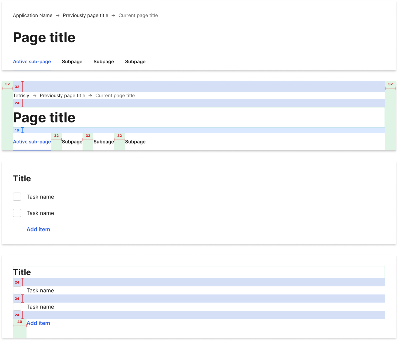
Every pixel is accounted for – utilizing an 8px grid within each element and spacing that is divisible by 4px.
BUILD USING BEST STANDARDS
Built with extreme attention to detail – using ideal file organization, inheritance structure, and design tokens that help teams build high-quality digital experiences, fast and efficiently!
RESEARCH AND ANALYZE
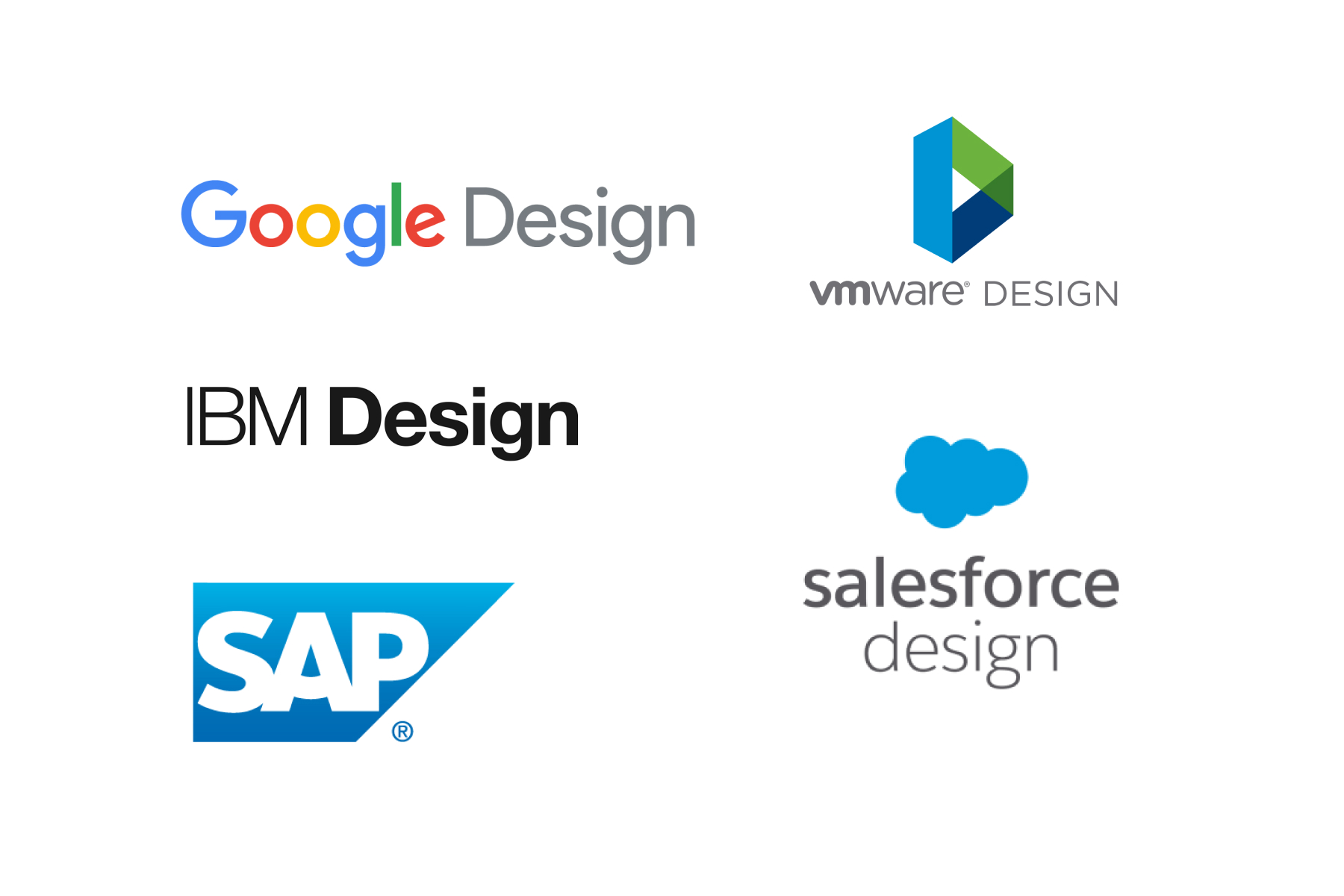
I researched and analyzed some of the most popular SaaS design systems, such as Google’s Material Design, IBM’s Carbon, SAP’s Fiori, Salesforce’s Lighting, and VMware’s Clarity. My goal was to understand the best practices for creating the perfect design system.
LIMITLESS CUSTOMIZATION
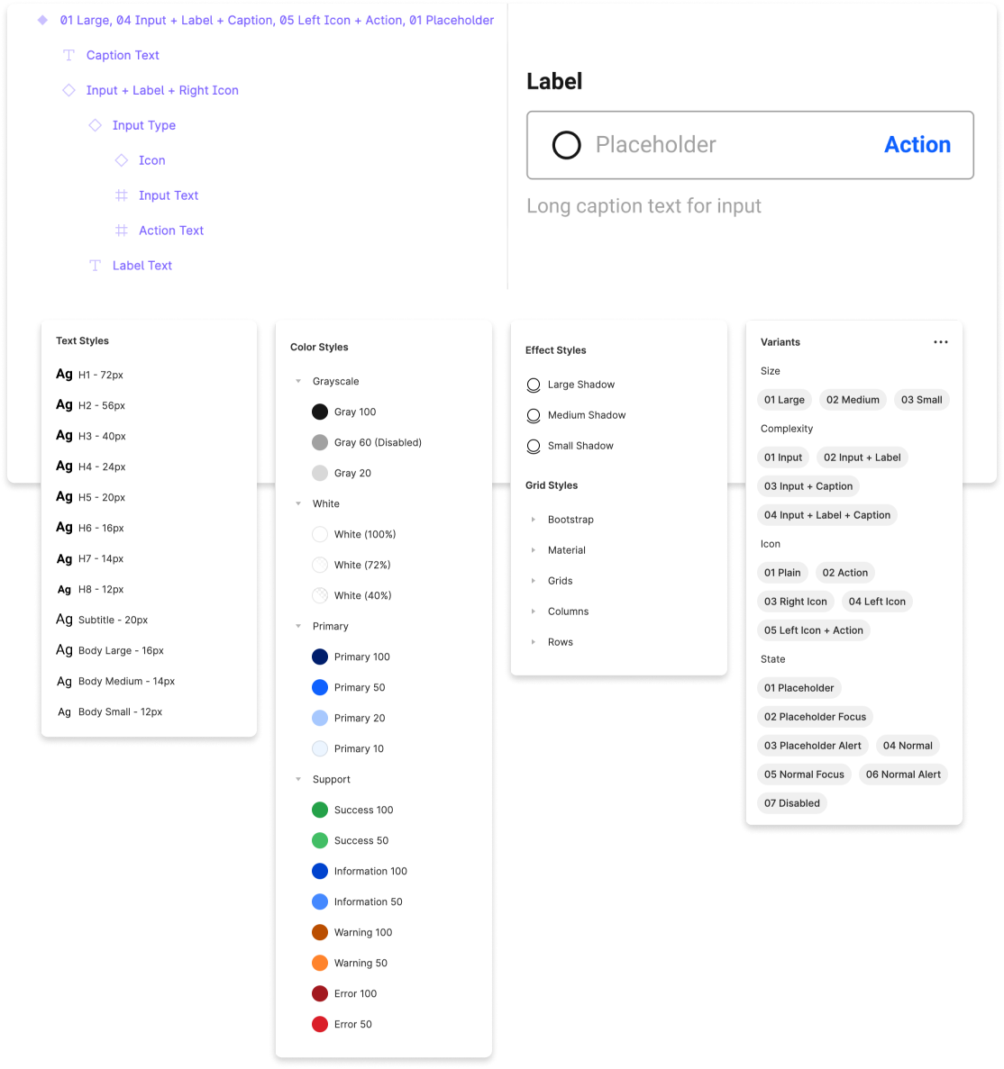
Using a set of predefined text and color styles, as well as easy-to-customize atomic components helps teams create unique and cohesive product appearances within minutes – by simply applying changes to all pages at once.
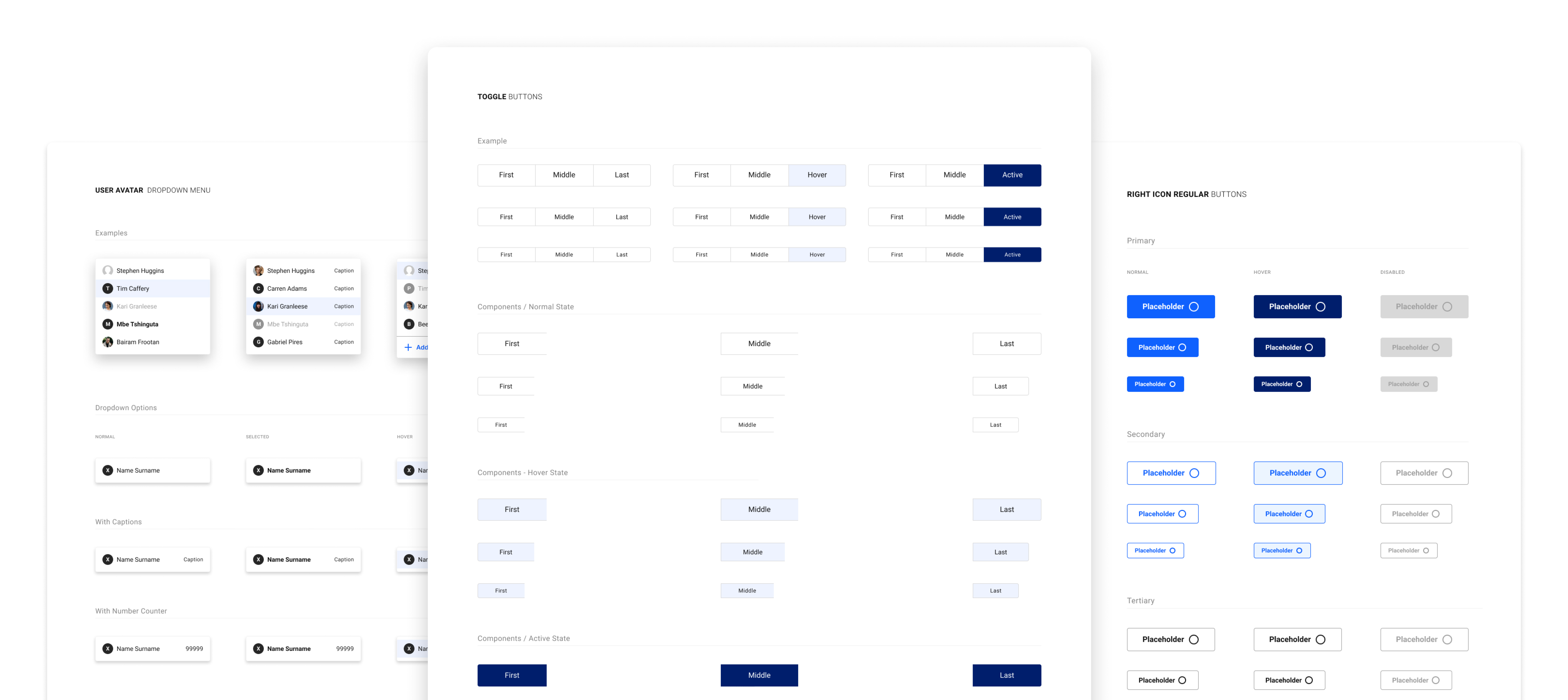

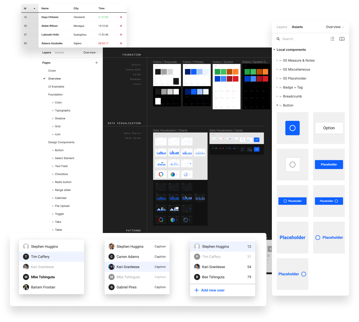
Ideal file organization and inheritance structure for seamless scalability
STRUCTURED AND ORGANIZED
With well organized file structure and naming convention, each component is grouped into a specific function – making it easier to scale the library and make necessary changes without accidental mistakes.
DATA CHARTS & GRAPHS
The component UI library includes the most commonly used charts and graphs – creating compatibility with most use cases in modern SaaS applications.
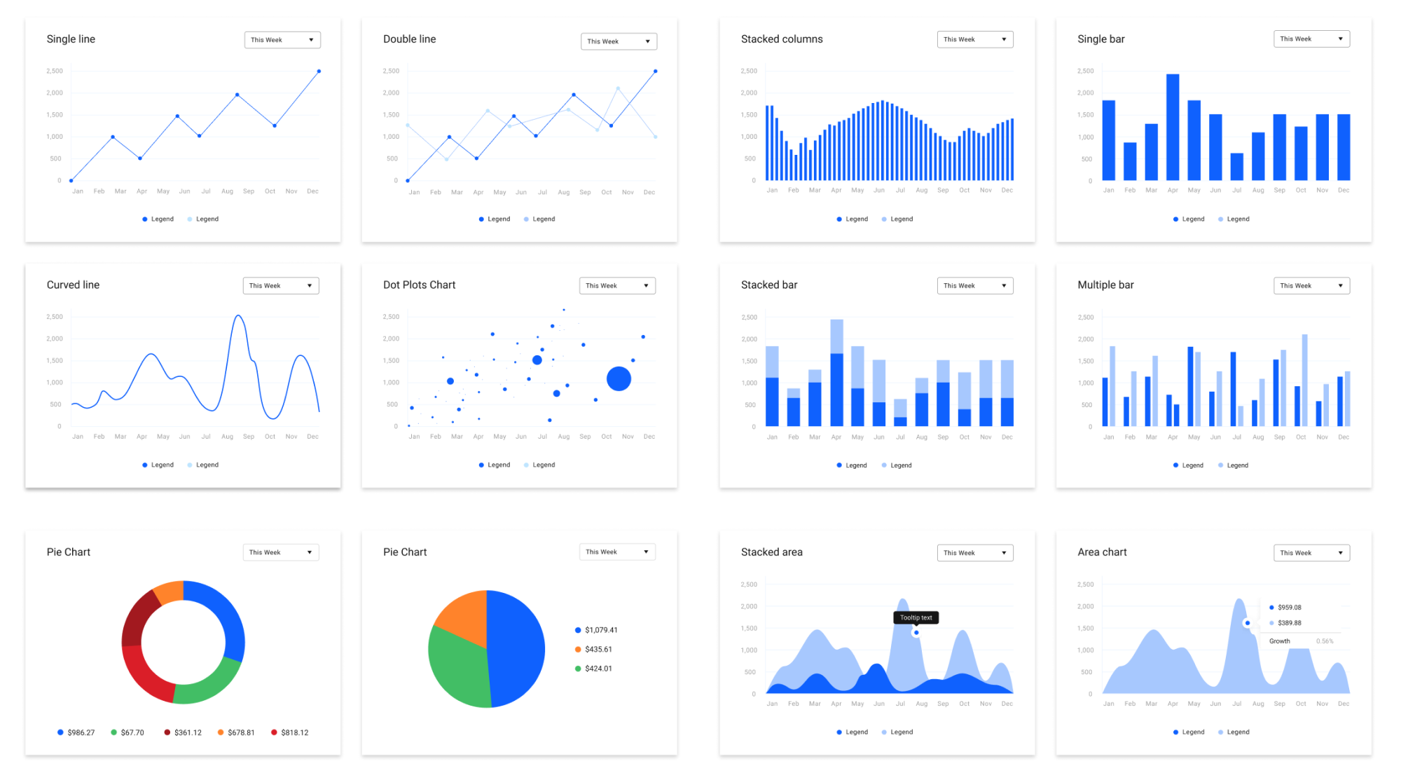

For every possible need and scenario.
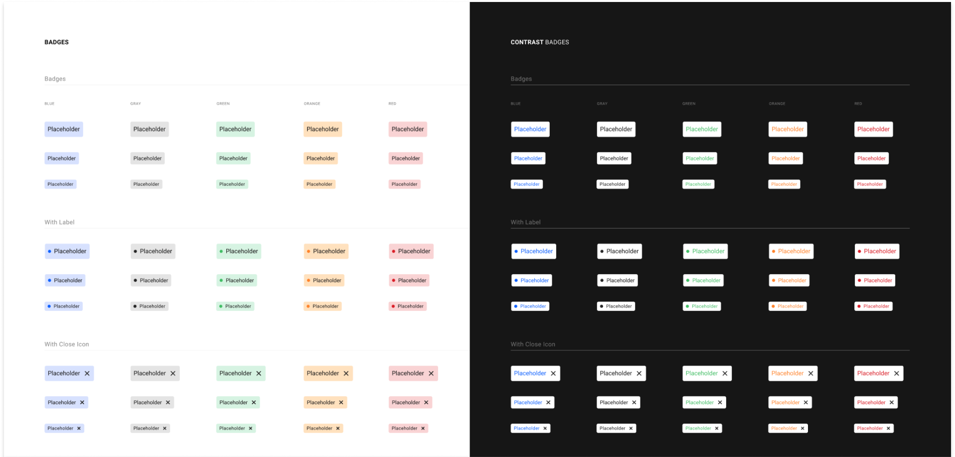
LIGHT & DARK MODE
Each component is created to be used within both light and dark design themes.
CARD BACKGROUND LAYERS
Utilizing a layering system as a background for each card component makes style changes fast and consistent, while protecting against accidental mistakes.
TYPOGRAPHY HIERARCHY SYSTEM
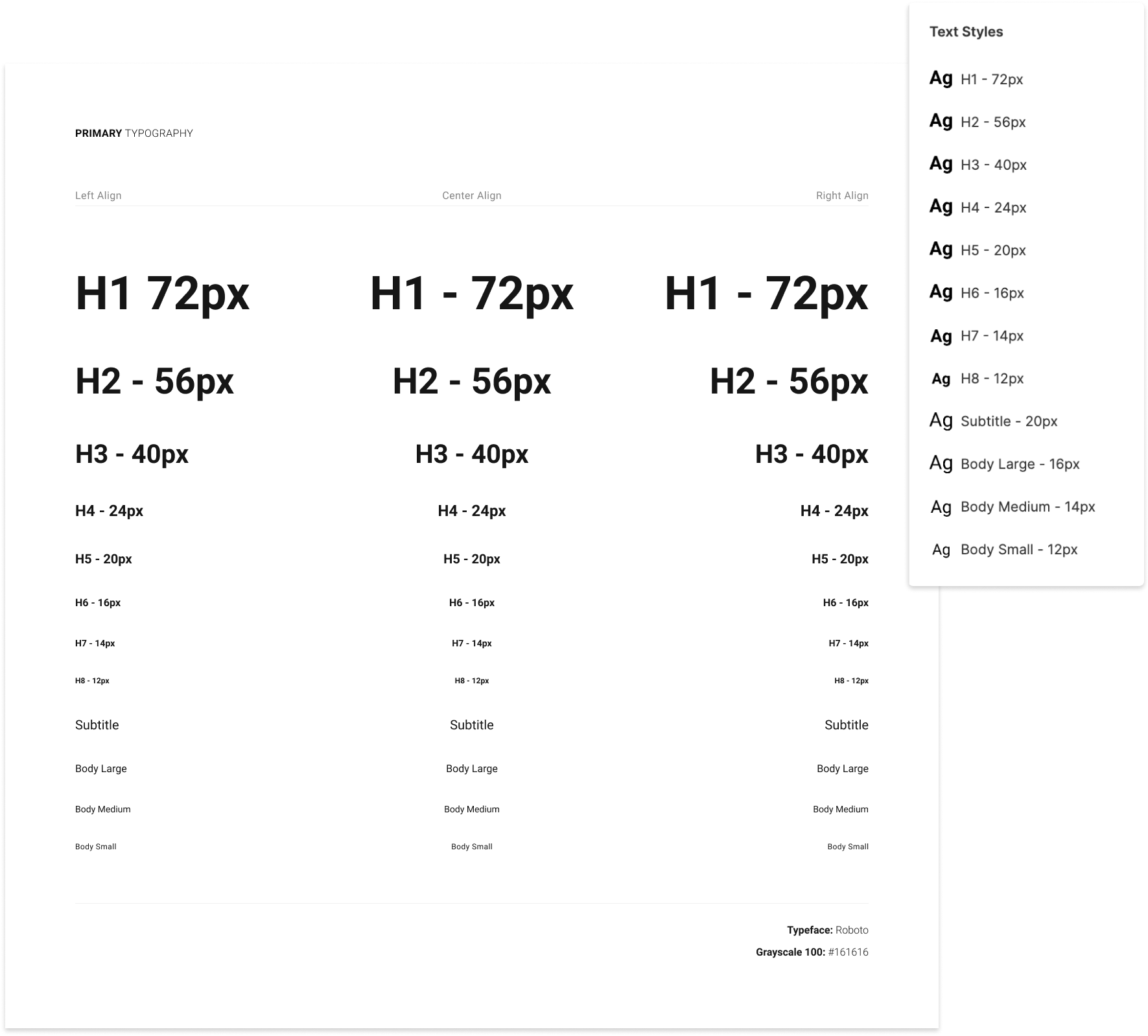
The typography system supports multiple hierarchies – allowing easy customization of global typography styles in just a few clicks.
FOUNDATION SYSTEM
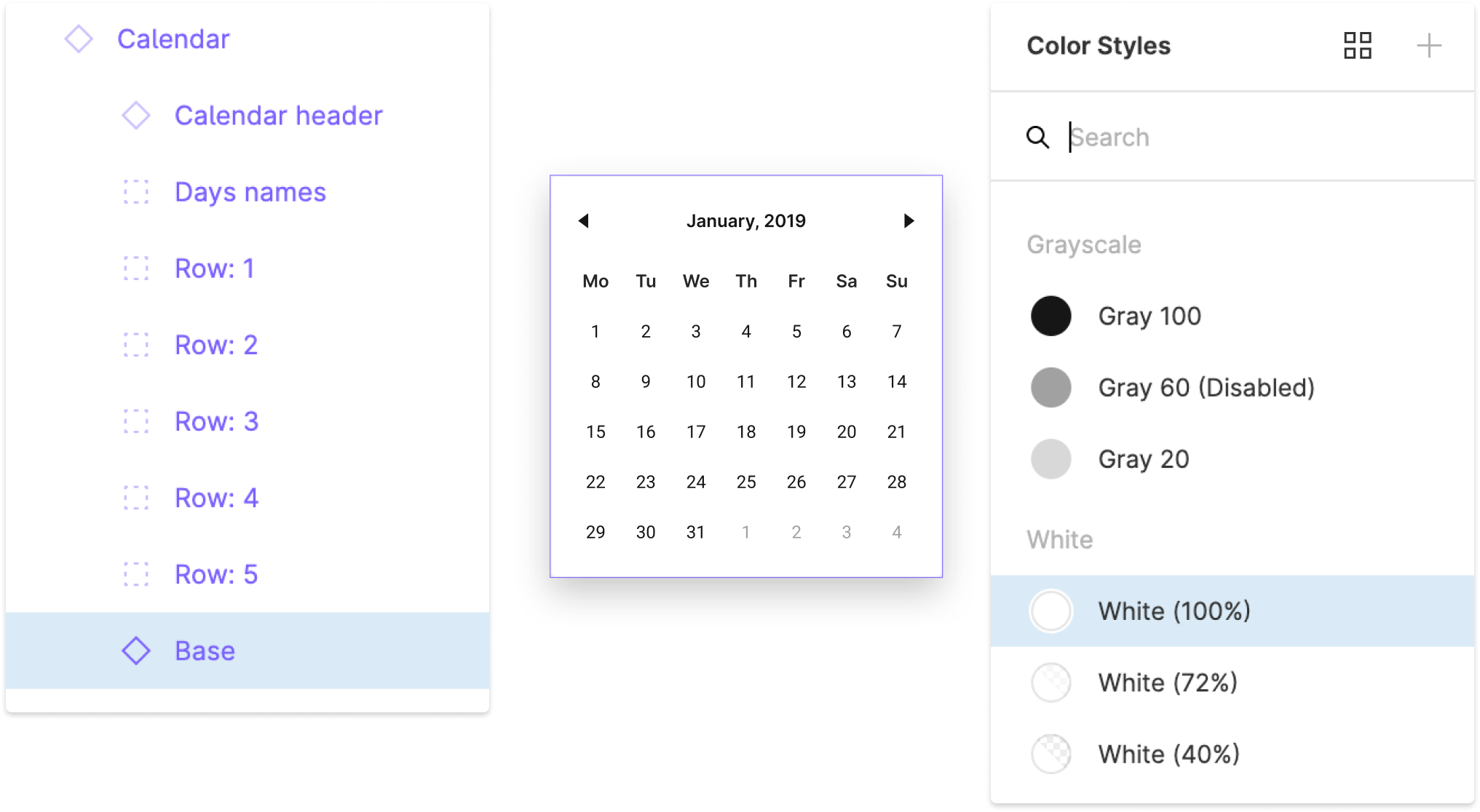
Using a foundation system, all similar components are synced together – making every change global.

LATEST TECHNOLOGY
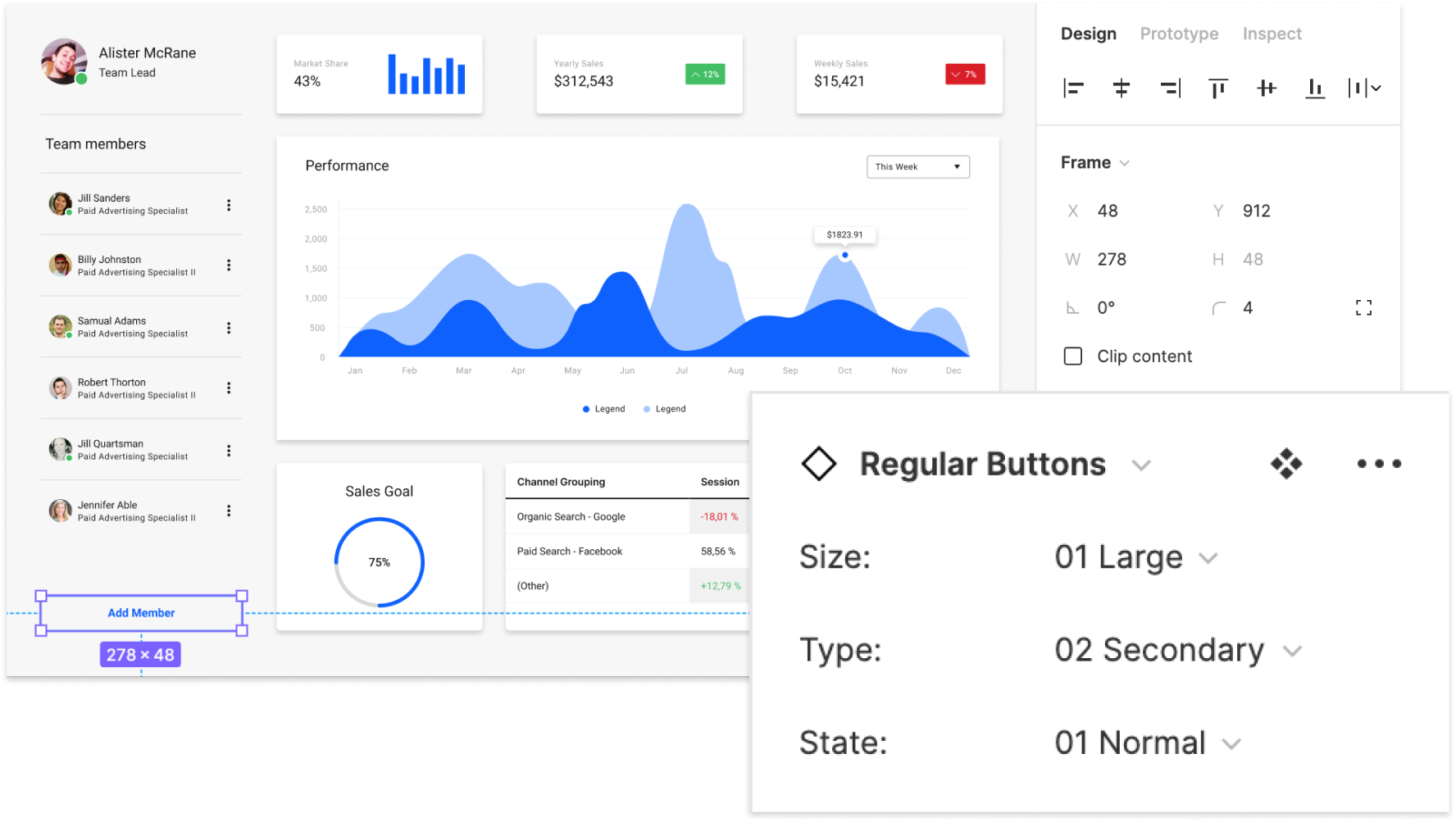
Utilizing Figma’s latest features (like Variants and Auto Layout) brings new possibilities to components and enhancements for scaling the design system.
UI PATTERNS
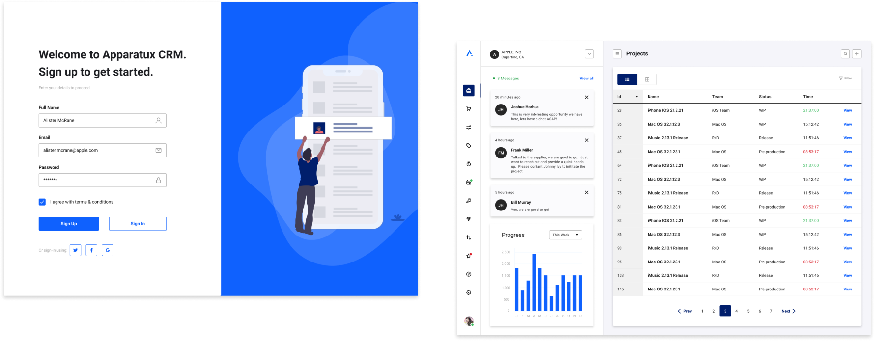
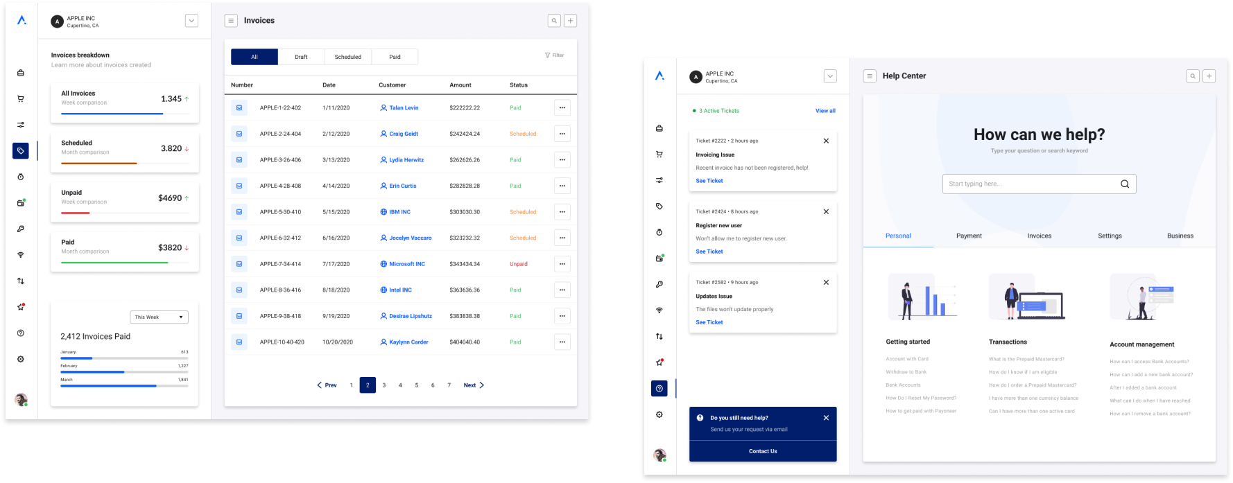
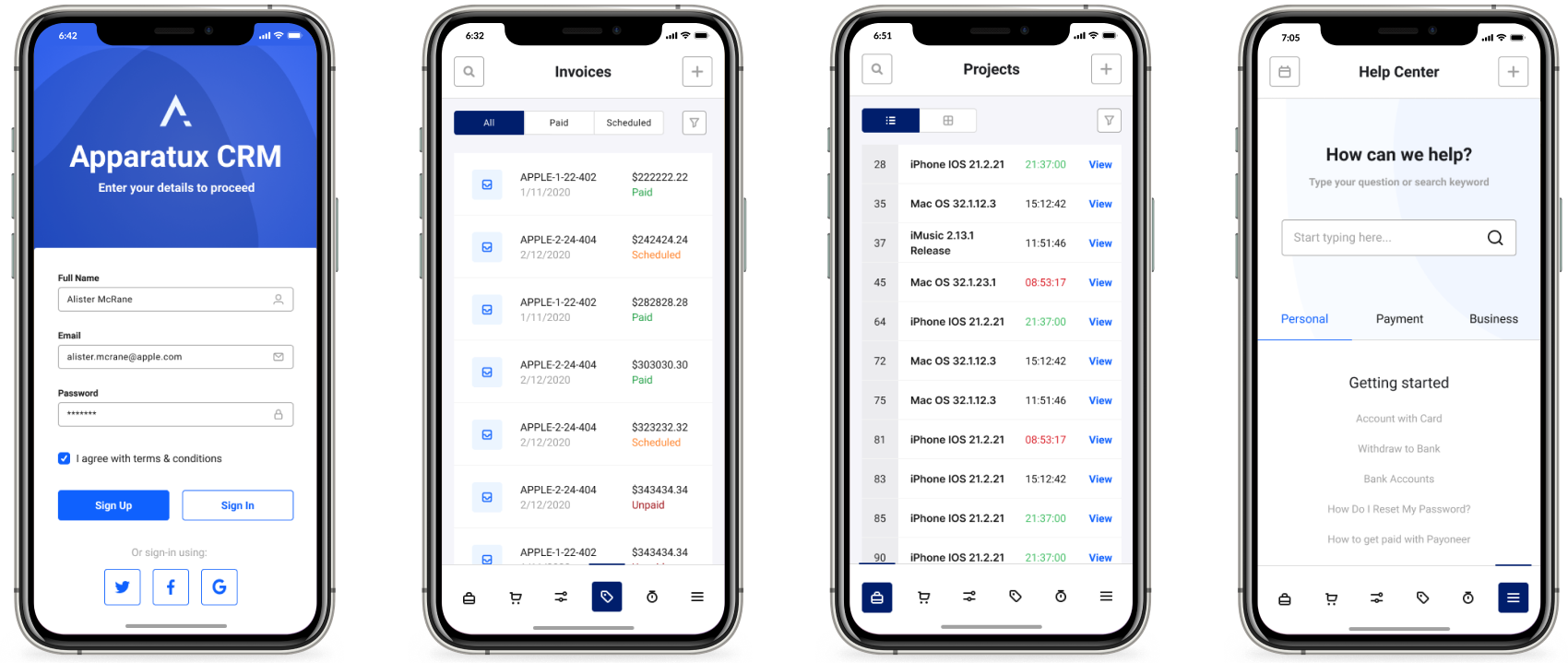
With the premade common pattern library, design teams can create complicated user interfaces in a matter of minutes.
PIXEL PERFECT PRODUCTS
Creating pixel perfect and beautiful products that users love and want to use has never been easier.

COMPONENTS

STYLES

CATEGORIES

PATTERNS

MY MISSION & GUARANTEE
By removing barriers to launching digital products, I deliver design solutions that matter – transforming the way we live.
I put my name on the line with every project that I work on – as a seal of my guarantee to deliver the best possible results.

