Overview
INFORMATION ARCHITECTURE (IA): Describes the hierarchy, navigation, features, and interactions of a website or application in a bird’s-eye-view.
STRUCTURE: IA enables us to make sense of complexity by effectively structuring and presenting content to users in a way that is relevant to their context and needs.
USER FOCUSED: Whether formed at the beginning or end of a project, a good information architecture is based on extensive user research.
BUILDING IA: The most important factors to building your IA are where individual components of the architecture are placed (hierarchically), and how they’re labeled and displayed.
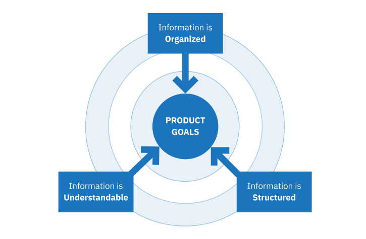
No matter what a project’s scope may be, designing a successful digital product requires that cross-functional teams work with large amounts of information, covering a product’s features and functions as well as user and business goals. To enable teams to effectively work together and meet the product goals, it is essential that that information is well-organized, well-structured, and understandable to the team.
“Information Architecture can be compared to a blue-print used to build a house”
What is Information Architecture?
Information architecture (IA) is a foundation to good design and efficient user experience. During the product development process, it determines how product information is displayed and accessed by organizing relevant information and depicting the product’s hierarchy, navigation, features, and interactions in a visual, bird’s-eye-view structure. As a backbone to design, IA allows teams to produce intuitive, user-friendly products that offer valuable and easy-to-find content to users.
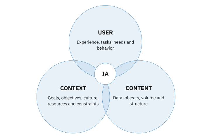
The Value of IA
IA is absolutely essential to good product design, as it helps align cross-functional product teams by enabling a team to easily discern product goals and requirements. In this way, product teams are able to provide users with meaningful content that is relevant to their users’ context and needs, as well as:
- Provide a more enjoyable product experience
- Adds a competitive advantage
- Reduce duplication efforts
- Enhance knowledge sharing
- Minimize documentation reliance
- Lower information-finding costs
The example shows consolidated Information Architecture sitemap of Drive Flex Payroll SaaS
“Don’t over complicate it – the key is not perfection. Aim to build a simple, adaptable IA.”
Building IA
While the idea of prioritizing and organizing information into an easily discernible format may seem simple in itself, the large amount of information involved in product design can make building IA a daunting task. A good approach to IA is to remember that there is no one-way of correctly organizing information – if it meets the needs of both the business and users, it is correct.
In general, building IA can be broken down into three main phases:
- Research
- Prioritize & Organize
- Design
- Mapping
Research
When building a good IA, researching what users need and want is one of the most important steps. Designers need to know the product’s users, range of content, context, and functionalities. Through research methods like user interviews, content inventory, and content audits, designers are able to identify product and user requirements, as well as how users interpret information and their mental models when using a product. When designers have this information, they are able to adapt the IA to best meet user needs.
Content Inventory
A content inventory is a quantitative analysis that identifies and catalogs the entire content within a product. A content inventory helps designers:
- Group related content and create categories
- Determine high-performance content, as well as low value content
- Identify inconsistencies
- Pinpoint challenges and opportunities for improvement
The example shows Content Inventory for Luminator mSET SaaS
Content Audit
A content audit is a qualitative analysis of a product’s information assets and content related to user experience. It helps designers identify the value of a product’s content for users.
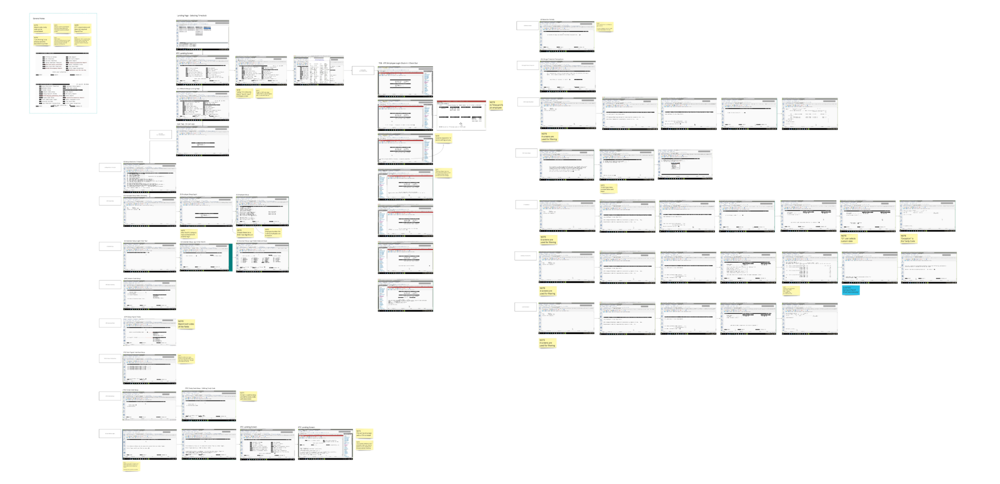
The example shows Content Audit for Payroll Settings CDK Drive Flex SaaS
User Interviews
User interviews are one-on-one discussions with users to answer targeted questions. These interviews are designed to discover user goals, needs, behaviors, motivations, mental models, and frustrations.
“Investing time in user research will deliver a solution that meets both business and user needs.”
Prioritize and Organize
Part of making a site easy to use is organizing information so that users can easily find what they’re looking for. After putting together a list of the product’s content, designers must prioritize and organize the content into groups that make sense to users. Classifying content in order to create hierarchy and organized meaning is important for IA. It helps define and assign content by similarity in order to easily find it again in the future. Two common methods of prioritizing and organizing content for IA are card sorting and taxonomy.
Card Sorting
Card sorting is a UX research method used to uncover how users sort or group labeled notecards according to patterns and criteria that make sense to them. This helps designers understand their users’ mental models, in order to create an IA that matches users’ expectations. There are two main types of card sorting:
Open Card Sorting – Users categorize topics in an order that makes sense to them. This helps designers understand how users think in terms of classifying content.
Closed Card Sorting – Users sort content according to predefined categories from a content inventory list.
Taxonomy
Labels play a significant role in how users find information within a product. Taxonomy is used to label information attributed to a product’s content based on similarities and differences. Using taxonomy, designers are able to create a hierarchical structure to dictate how that content is accessed. When creating a taxonomy, designers work through two stages:
Information Grouping – Identify relationships between content.
Taxonomy Development – Create a standardized language for terms.
The example shows Stakeholder & SMEs research synthesis for SambaSafety Qorta SaaS
“A meaningful information architecture makes a design valuable, not just good looking.”
Mapping
Based on information gathered during research and hierarchy creation, designers sketch and map out screens to demonstrate the content present on individual product pages and how the content will be arranged. When mapping, it is important that designers focus on presenting the content to users in a meaningful way that aligns with their needs, goals, and behaviors. To do this, designers apply the following eight principles:
1. Principle of Objects
Different content has different attributes and behaviors. Designers should treat the content as a living, breathing thing with a lifecycle, behaviors, and attributes.
2. Principle of Choices
Designers should aim to create a product experience that is effortless and user-friendly. To do this, it is important to create pages that offer users meaningful choices, while keeping the range of choices focused on a particular task. This is because too many choices require more cognitive effort and become overwhelming to users.
3. Principle of Disclosure
Designers should avoid overwhelming users with information, by only displaying enough information to help users complete a given task. This allows users to absorb the information they see better, and helps users determine whether they are interested in digging deeper into more detailed information.
4. Principle of exemplars
To make it easy for users to identify categories, the navigation should be designed to incorporate examples. Showing examples of content helps users understand category contents.
5. Principle of Front Doors
It is safe to assume that at least half of a product’s users will access it through an unexpected path. For this reason, each page within a product should provide users with information on their location and the actions available to them.
6. Principle of Multiple Classification
Because different users will have different mental models and different ways of classifying information, it is important to offer users different ways of browsing product content.
7. Principle of Focused Navigation
It is important to design each navigation with a singular purpose, and keep navigation menus simple.
8. Principle of Growth
Designers should anticipate how a product might grow over time, and design the product to be scalable as patterns, templates, navigational systems, and content change and grow.
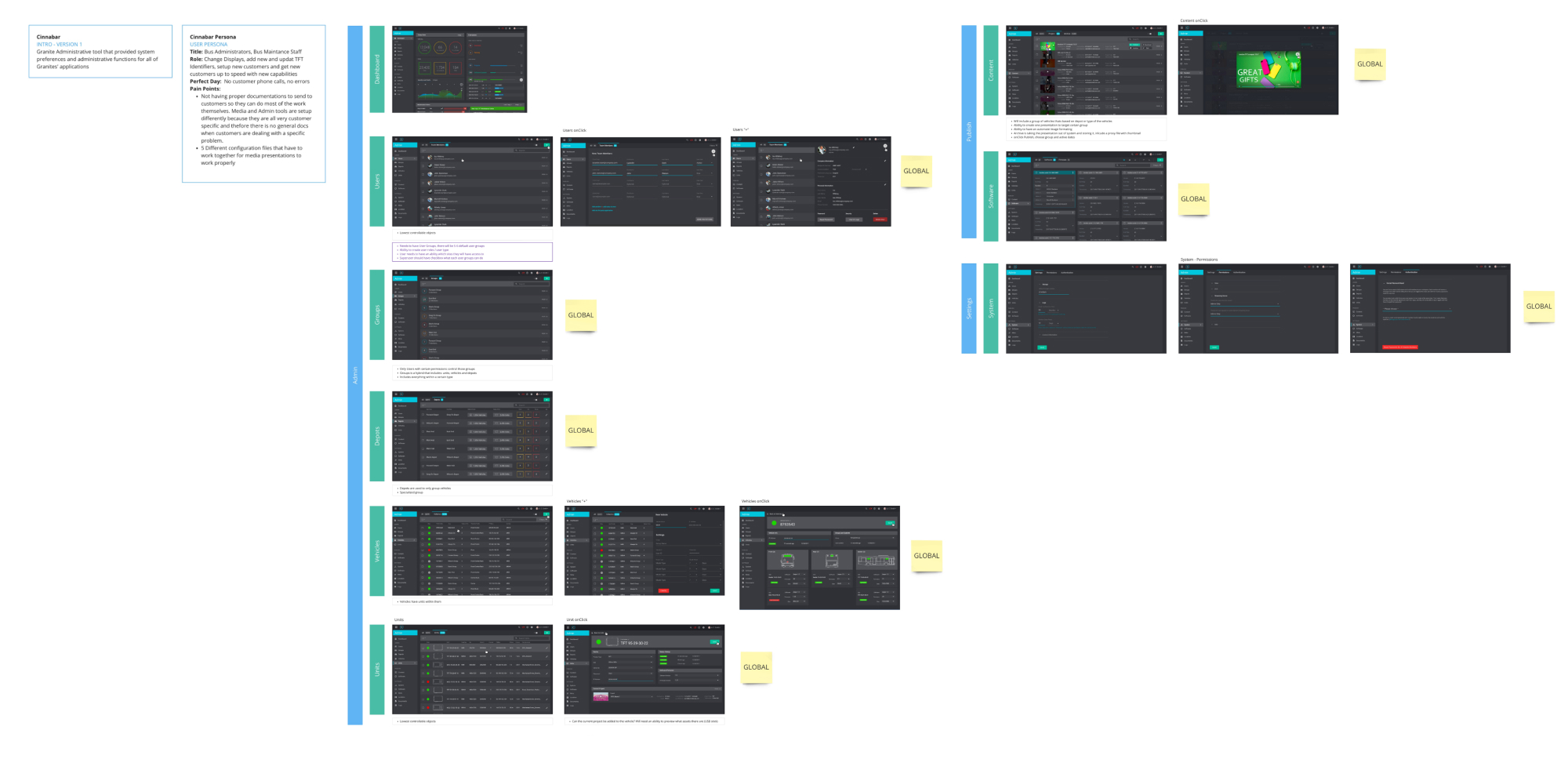
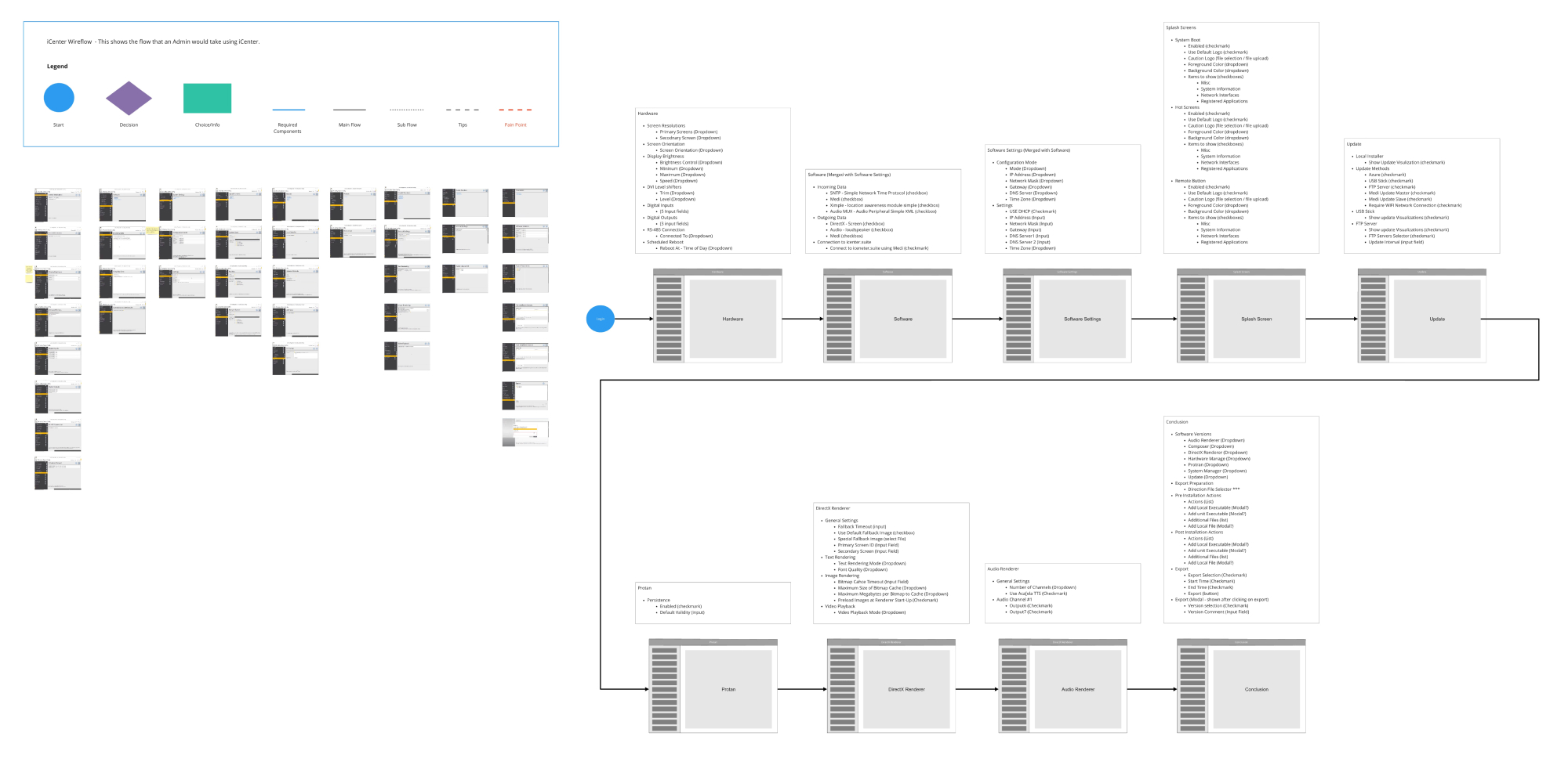
The example shows mapping workflow for Luminator – mSET SaaS
“Information architecture should be fluid, as product requirements can change over time.”
Conclusion
Information architecture is the backbone of every product, and should be taken seriously from the very start of a project. With good information architecture, it becomes significantly easier to make key product decisions in order to provide efficient and meaningful user experience as products evolve, designs change, and users adapt throughout a product’s life cycle.
Read more in Nielsen Norman Group, Adobe XD Ideas, and Information Architecture Principles.


