Overview
COHESIVENESS: A design system is a collection of guidelines and reusable elements for building cohesive user experiences and brand standards across products.
AUTOMATION: A change to an asset within a design system is automatically reflected across products.
CONSISTENCY: Design systems can help companies increase the consistency among their products, boost product team efficiency, and save money, as well as provide a quicker time-to-market.
MEASURE & TEST: After implementation, it is important to test a design system in order to measure its success and identify opportunities for improvement.
In today’s market, product success rates depend heavily on user experience. Now, more than ever, users expect to have seamless experiences between multiple platforms and surfaces. As a result, design systems are becoming more popular as designers struggle to deliver cohesive digital experiences for products across company brands.
“A design system is basically the story of how an organization builds a digital product”
– Brad Frost, Atomic Design
What is a Design System?
A design system is a collection of guidelines and reusable elements that help designers and developers work efficiently as they build cohesive user experiences and brand standards across products. A complete design system contains a great deal of information, and should define specifications such as:
- Style Guide: A written set of rules to define and maintain a company’s branding appearance and how it’s represented through visual elements and written content.
- Governances: The policies and philosophy that guide design and clarify why components are used in a specific way.
- Design Principles: The visual elements of the design system, including: action colors, palettes, typography, and more.
- Patterns: The individual pieces that are used to create meaningful product experiences and define the brand.
- Components: The reusable elements that product teams use to build consistent experiences.
- Rules and Spacings: Guidelines defining how assets sit with each other, as well as the amount of space between them.
- Content Tone: The brand language used throughout a product experience.
Why Use Design Systems?
The information within a design system helps cross-functional teams collaborate, in order to create seamless user experiences and maintain brand consistency.
In addition, because the assets within a design system are directly recalled in-code, any changes to the assets within a design system are automatically reflected across all products. This increases the autonomy and efficiency of developers and designers, allowing them to provide a faster time-to-market and save money. In his article for Adobe, Talin Wadsworth does a great job of highlighting how design systems help companies improve the speed, scale, collaboration, and innovation of product teams.
“Here’s the simple truth: you can’t innovate on products without first innovating the way you build them.”
– Alex Schleifer, VP of Design at Airbnb
Building Design Systems
Starting, implementing, and maintaining a design system takes a lot of effort. It is important to involve individuals from cross-functional teams from the start of the process, in order to accurately consider all perspectives, and define problems and solutions in a visually and structurally consistent design.
When it comes to building a design system, the needs of different businesses and products can vary. Yet, there are a few steps that most teams will encounter during the building process, including:
- Taking a UI Inventory
- Securing a Buy-in
- Establishing a Style Guide
- Creating a Component Library
UI Inventory
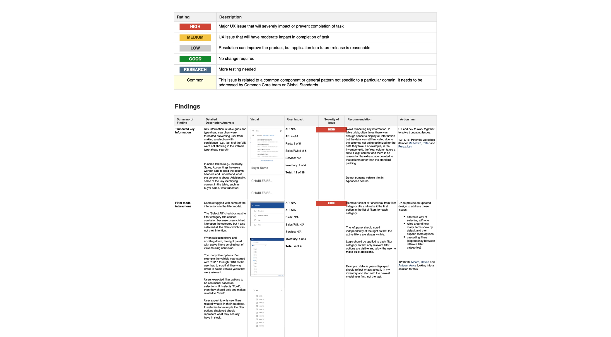
Generally, one of the first things a team will do when building a design system is to take inventory of all the design patterns currently used within a brand’s product interfaces, and document any inconsistencies that are discovered within them. The inventory should be holistic, and include all the different patterns, colors, text styles and assets used within the brand’s product.
The example shows part of UI Inventory for Drive Flex Payroll SaaS
Securing a Buy-in
Communicating the benefits of building and implementing a design system to a company isn’t always easy. Value needs to be shown. Highlighting a lack of organization within design files, as well as the inconsistencies discovered in the UI inventory will help to clearly show how the experience of users is being negatively impacted.
Style Guide
With a secure buy-in, the team can begin adapting their findings from the UI inventory into a style guide. A written set of rules, the style guide establishes design principles and guidelines to define and maintain a consistent branding appearance and helps designers and developers make meaningful design decisions.
Style guides are often quite complex and can encompass the following:
- Design Principles: Defines how to use design components, and why the components should be used in a certain way.
- Brand Style Guide: Defines how a brand is consistently represented throughout different platforms.
- Writing Styles: Defines the grammar, brand voice, and messaging tones that will be used to communicate with users.
- Iconography: Defines and highlights commonly used icons, and provides guidance for creating and choosing new icons to implement.
- Imagery: Defines and catalogs existing imagery options, and provides guidelines on how to use them.
- Pattern Library: Defines and organizes the reusable components that can be used to build products.
- Code Style Guide: Defines the best practices that can be used to produce maintainable and scalable code for other team members to understand and reuse.
Component Library
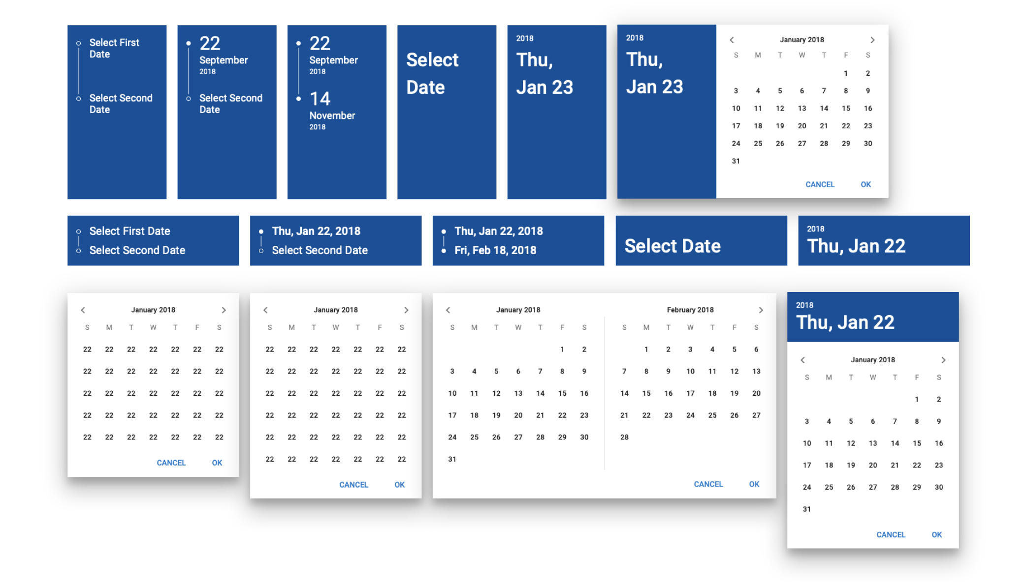
With the design principles of the style guide defined, the team can begin translating the style guide into code, creating a library of reusable elements. Consisting of all the designed and styled parts of a product, a component library should help product teams build consistent experiences and become highly efficient, when executed correctly.
The example shows “calendar picker” as a part of component library for Drive Flex Payroll SaaS

Measuring Success
Like any product, a design system should evolve and grow with the company – some components will need to be modified and some removed. To do this, teams often use a build, measure, and learn process to test a design system, measure its success, and identify opportunities for improvement.
Feedback from external users, as well as internal designers and developers can provide the insight needed to help the system evolve successfully. To get the feedback needed, companies often use a combination of different research or testing methods, including:
- Quantitative Research
- Qualitative Research
- Market Research
- User Testing
- Internal Feedback
Resources
- Designsystems.io – Global site centered around design systems, DesignOps, and everything that revolves around them for designers, developers, product managers, and more.
- Design System Repo – A comprehensive and curated list of design systems, style guides and pattern libraries that you can use for inspiration.
Conclusion
At its core, a design system is a product that serves larger products. Whether its intended use is to build something more creative or to keep the user experience of products consistent, a design system can be a game changer when built and utilized correctly.
Essentially what makes a design system is the sum of its parts and the connection between these working towards a defined purpose.
Read more in Adobe’s Design Systems E-book, Invision’s Guide to Design Systems, and Building a Design System.


